These days, it’s easier than ever to create a great looking website. All you need to do is sign up to one of the many free website builders and in minutes you can have a sleek and attractive looking site. Sadly, many of these website builder sites don’t take into account the basic principles of web design.
Although a website may look good, it can be far from functional and suited for the user’s needs. Template-based websites that aren’t designed with your particular target audience in mind are the exact opposite of effective web design. Effective web design is determined by users and their experience of a website. This is referred to as “UX”.
Great website design goes far beyond mere aesthetics. Great web design also needs to consider the usability of a website. What’s more, poorly-designed websites don’t tend to perform well in search engines because of high bounce rates and low conversions.
1. A clear purpose

A well-designed website caters for the needs of its target audience. And the best way to make a website that caters for your target audience is to have a very clear purpose.
Web designers ensure every site, page, and section they work on has a clear and definitive purpose that it aims to address. This could be anything from providing information and offering entertainment to allowing a type of interaction and completing a transaction.
Crowded pages don’t work because when there are too many elements on the page, it leads to sensory overload, causing distraction and confusion. Great web design is clean and simple and built to fit directly in line with what the end-user wants.
2. Speed

Even if every aspect of your site has a clear purpose, if it takes ages to load, then it’s basically all for nothing. Users have very little time and plenty of choices, so if a website is too slow to load, very few users will hang around waiting – as shown in this article.
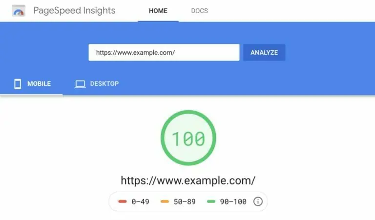
There are plenty of tools and tricks designers and website owners can use to optimise their site loading times. Some of these include optimising image sizes, combining code into a central CSS or JavaScript file, and minifying HTML, CSS, and JavaScript. Improving speed and performance is an ongoing task, so make sure to track any of your changes using tools like Google PageSpeed Checker.
3. Typography

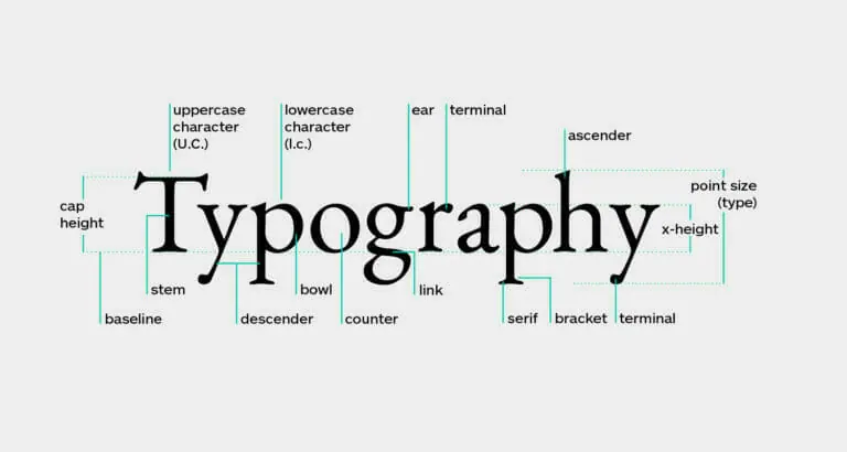
Typography refers to the fonts used on your website and includes the style, size, weight of the font. Typography is often overlooked for its impact on the overall success of a website, even though text generally takes up a high percentage of the space on most sites.
Getting the typography formula right is not easy but can have a big impact on the readability of your website. Sans Serif fonts – fonts without decorative finishes like Arial, Helvetica, and Verdana – are easiest to read on a screen.
Although there aren’t any hard and fast “rules” for font sizing, it is recommended not to use fonts smaller than 16px for ease of readability. Stick to a maximum of three-point sizes for a streamlined design and no more than three typefaces across headings, body, and elements like buttons.
4. Colour

Colours can go a long way to enhance your user’s experience.
Complementary colours create balance and harmony. Using contrasting colours for the text and background will make reading easier on the eye. Vibrant colours should be used sparingly, for example for buttons.
Similarly, “white space” can alter the look and feel of your website drastically. Ensuring you leave enough white space around elements gives your site a modern, uncluttered feel. White space refers to the empty space between headlines and text or sections of a website. Cramming everything together makes the site harder to read, which can force your audience to leave your site quickly.
5. Mobile friendly (Responsive Design)
If your website is not easily readable across multiple devices and screen sizes, it will struggle to not only attract users, but will also be penalised by search engines like Google. The Google Search Engine algorithm places particular emphasis on the end-user experience and includes those metrics heavily when ranking a website.
With the growing use of mobile devices, ensuring that your website is responsive to different screen sizes is mandatory.

Of course, there are many more considerations to take into account when developing your next website, but these principles of web design are a pretty decent start.
Web design is an ever-evolving field. But if you put these web design principles into practice today, you will be on the right track to a high converting website. Contact us today to see how we use these principles to give your website the best start possible.
